Download Creating an APA Style Graph in EXCEL 2007: A Step-by-Step Guide and more Lecture notes MS Microsoft Excel skills in PDF only on Docsity!
How to make a graph an APA Style Graph in EXCEL 2007
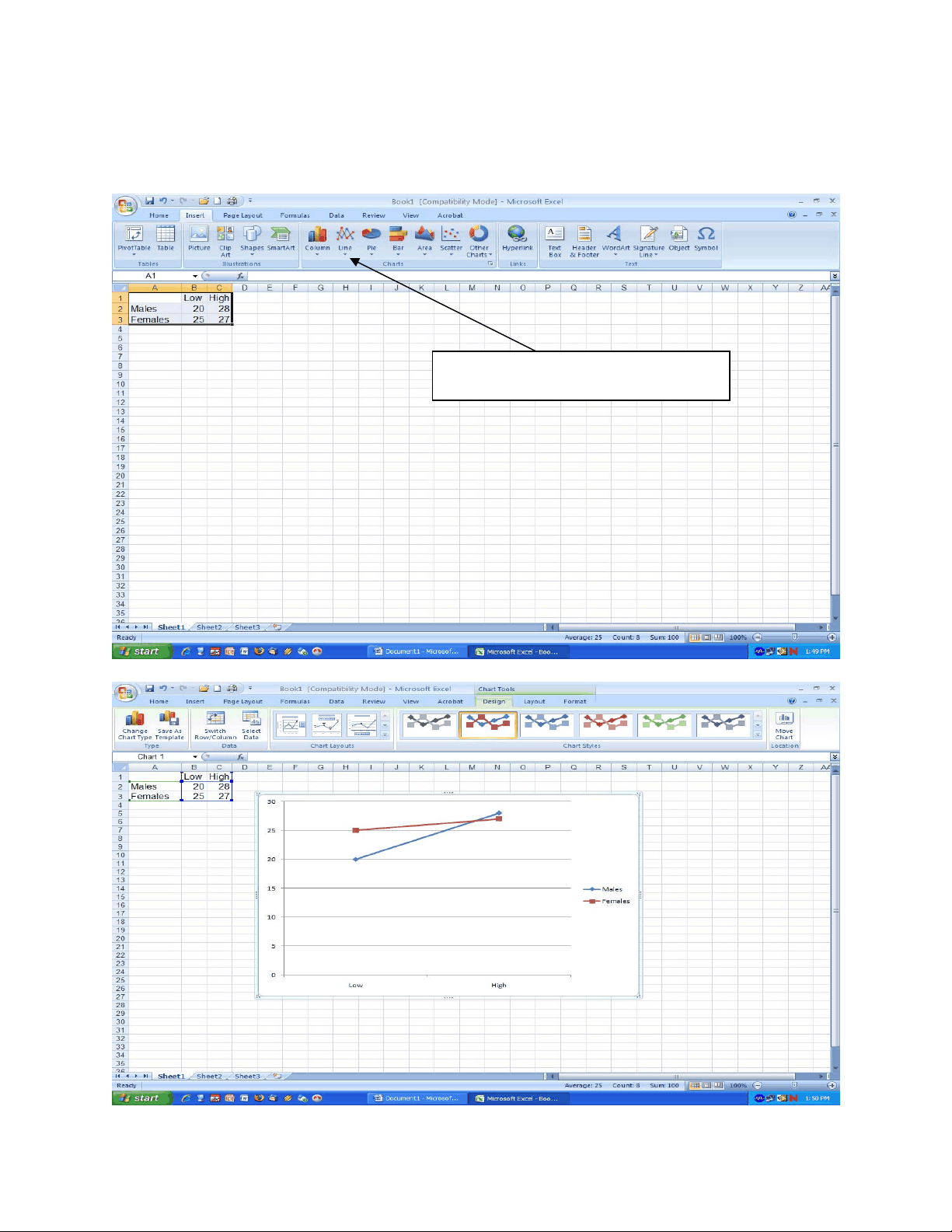
First enter your data into the spreadsheet. Remember that if you are making an interaction graph then you must use the CELL MEANS! Next, click on the “Insert Tab”
Next, click the line graph button
You will then get something like this:
Now we want to move this graph so it is all by itself, so hover over the graph with your mouse then right click so a menu pops up like so:
Choose move chart and make it a new sheet called Chart 1
Now your Excel window will look like this:
Then click on Format and then click on Shape Outline and click the box that says no outline
Next you need to add Axis Labels. Do that by making sure the graph has still been selected (double click the graph) and then look for the ribbon tab called Layout and click on the button called axis titles and type in a label for each axis. See Figure below.
Make sure that you name each axis with an appropriate title.
One final thing you may or may not want to do is remove the grid lines, sometimes it makes the line graph look neater. To do that, just click on e of the grid lines then right mouse button click to get the menu. Then choose delete and that will remove the gridlines.
You’re almost done, now it’s just a matter of cleaning up the graph a bit. You need to double click each axis and increase the font to around 14 or 16 depending on size of graph. Make sure you are suing the same font for all text (Times new Roman). If you want to change the colors of your lines just double click it and change it.